Identity & Branding
LOGOS ARE THE FUN PART. IDENTITIES ARE MORE INTERESTING.
Building a graphic identity starts with loose experimentation and ends with tight implementation. We don’t stop until everyone is satisfied.
Making a logo involves multiple disciplines—art and business history, typography, iconography, contemporary trend analysis—and soft skills like presentation, patience and really listening. It requires a creative juggling of multiple concepts, client demands and artistic directions to arrive at a mark that works for you. When you get it right, you know it.
The best path is to agree on the goals of the identity and then try as many approaches as necessary to arrive at a few that deserve exploration.
Sometimes we have to go back to the drawing board and start again. Ultimately, a preferred final candidate is refined to finished art, typography and color.
But that is only the start of an identity program. Creating a consistent, repetitive environment for the new mark is imperative to its success because that is the secret to branding. To that end, a standards manual demonstrates as many instances of its use as possible while incorrect applications of the logo are presented and discouraged.
As Many as It Takes
AT AURAS we keep going until the client is satisfied and we feel we have done the best we can. Sometimes that can mean dozens of approaches:
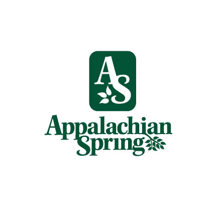
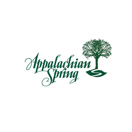
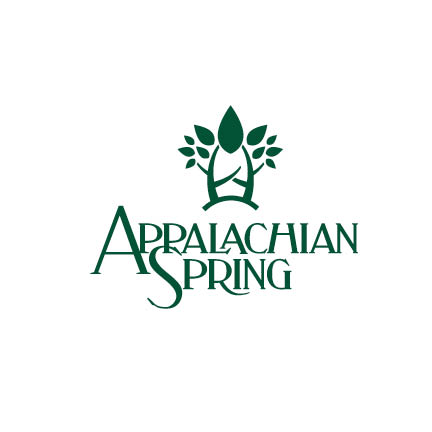
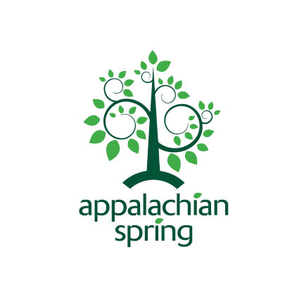
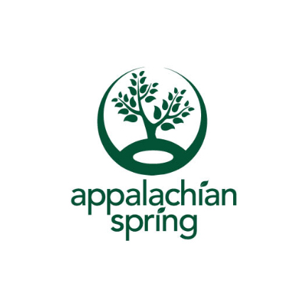
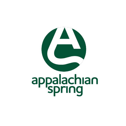
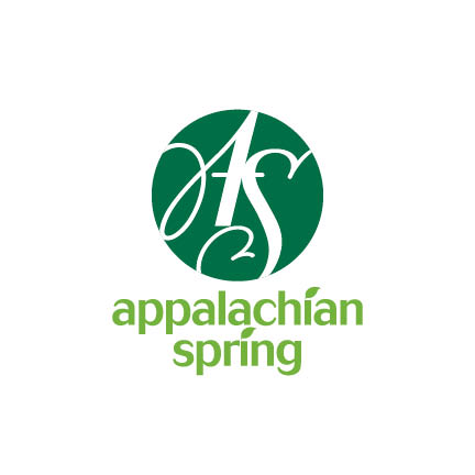
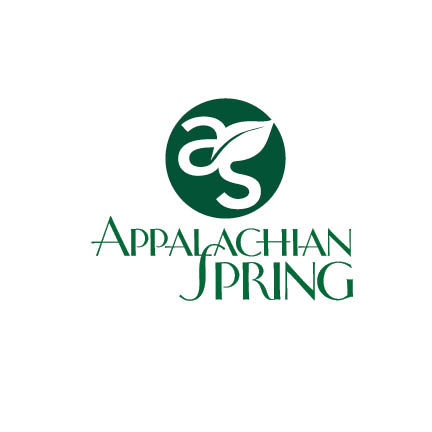
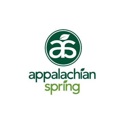
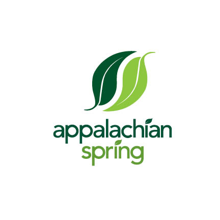
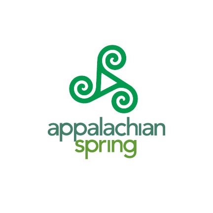
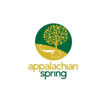
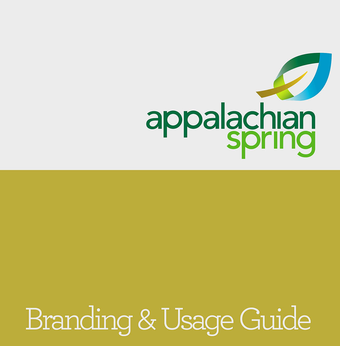
Taking almost a year, the rebranding of Appalachian Spring, a fine arts craft store, required lots of exploration to finally find a new design that both the client and AURAS liked.
More examples from AURAS, because we don't want to you miss our mark.
AURAS Logo Poster
Here are some of the logos that we have created over the years for business identities, promotional campaigns and conferences.
More Than A Logo
The development of a complete identity involves building a color palette, secondary typography and demonstrating consistent usage through example built from these elements.
Which One Would You Choose?
Designing a new identity begins with the logo—and we like to present many choices. We’ve gone back through some of our presentations and packaged some of the logo candidates. Roll over the boxes to see which ones the client chose (and what we thought of their choice). Check back every now and then; we’ll change these out for new ones and you can play the game again.