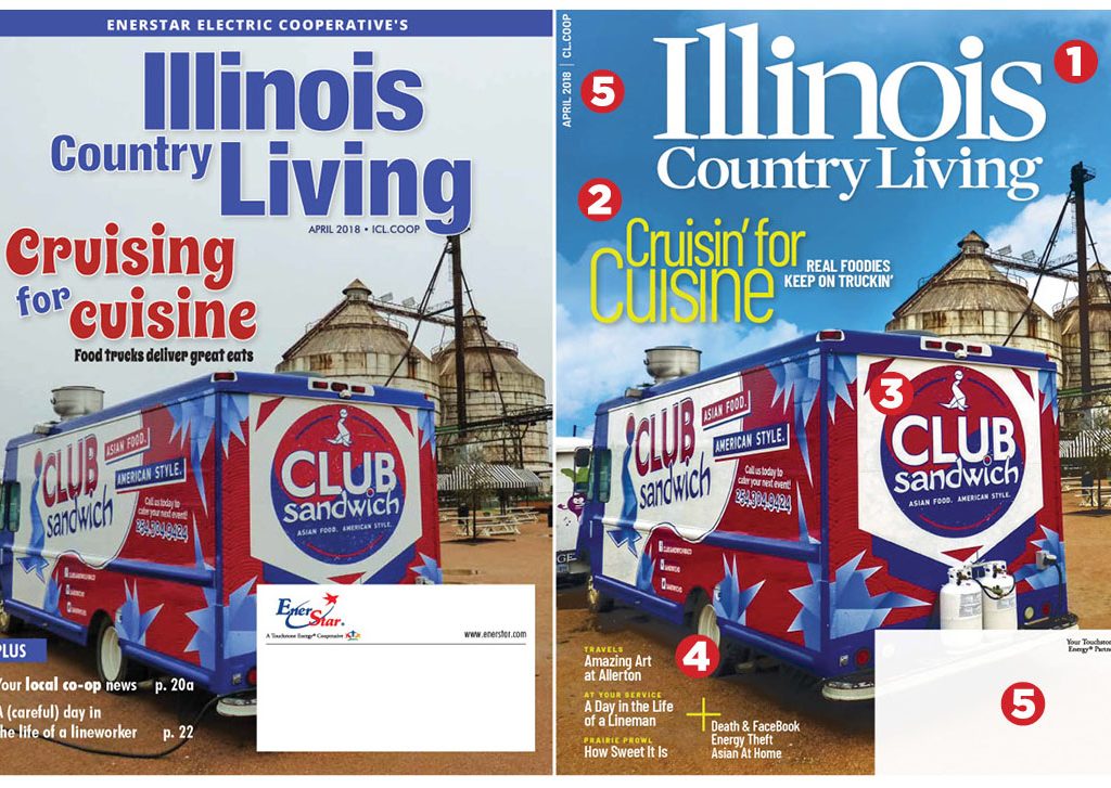
In the publication page of the site, you’ll see a montage of before-and-after cover designs. One, in particular, is most interesting. The covers of Illinois Country Living, a redesign done last year, shows the exact same cover image and cover lines. This serves as a perfect example of how a cover can be improved by creating a strong cover template. Here are five ways that almost any cover can be redesigned for the better.

1. New nameplate If you consider a nameplate the “logotype” of your magazine it should have an internal consistency, a clean contained shape and feature the most activating word for prominence. The new nameplate highlights “Illinois” because it’s the operative word in regional lifestyle publications. There are lots of “Country Living” magazines in the world of electric co–ops. The distinctive flags on the serifs add to the brand.
2. Consistent coverlines The desire to add liveliness to a cover when the image is not particularly exciting can overwhelm the necessity of creating a cover template that uses typographic theme-and-variation to create consistency across issues. That doesn’t mean these cover lines have to be boring, they just have to follow the type design variations allowed in the template—and content counts, so a zippy headline is as much an editorial creation as a visual one. The use of ornamental or illustrative headline fonts depreciates the branding value of the cover and can even hurt legibility. Ask yourself, “which LOOKS more like the cover of my magazine.”
3. Enhance your images That is the same image on both covers but a little creative work in Photoshop added a sky that works better with the type, and a brighter “sunnier” impact to the overall image. While the images are identical, the cropping around the truck is tighter to make it more prominently the center of attention and leave a better space for secondary coverlines. Sure, it would have been better with people at the picnic tables or a line at the truck, but you work with what you have. So the first rule is: Get better images to start with.
4. Build branding and interest with secondary coverline design The deck/head rhythm in the secondary lines, an iconic plus sign instead of the word “plus” and some sharper writing encourages readers into the magazine while increasing the branding of the template
5. Details matter Moving the address box to bleed and adding a hint of transparency minimizes the impact on the overall cover. Putting variable data like the date and volume away from the nameplate adds distinctive elements to the template.