I was watching 2019’s Ford vs. Ferrari last evening. The movie is the story of the rivalry at Le Mans between Enrico Ferrari and Henry Ford II in the nineteen-sixties, and how (spoiler alert!) upstart Ford ultimately beat the smug Italians.
The production does an amazing job of recreating the time period through locations, sets, props and costuming. But maybe because it’s my business, one scene broke the fourth wall for me all because some set dresser made a rookie mistake.
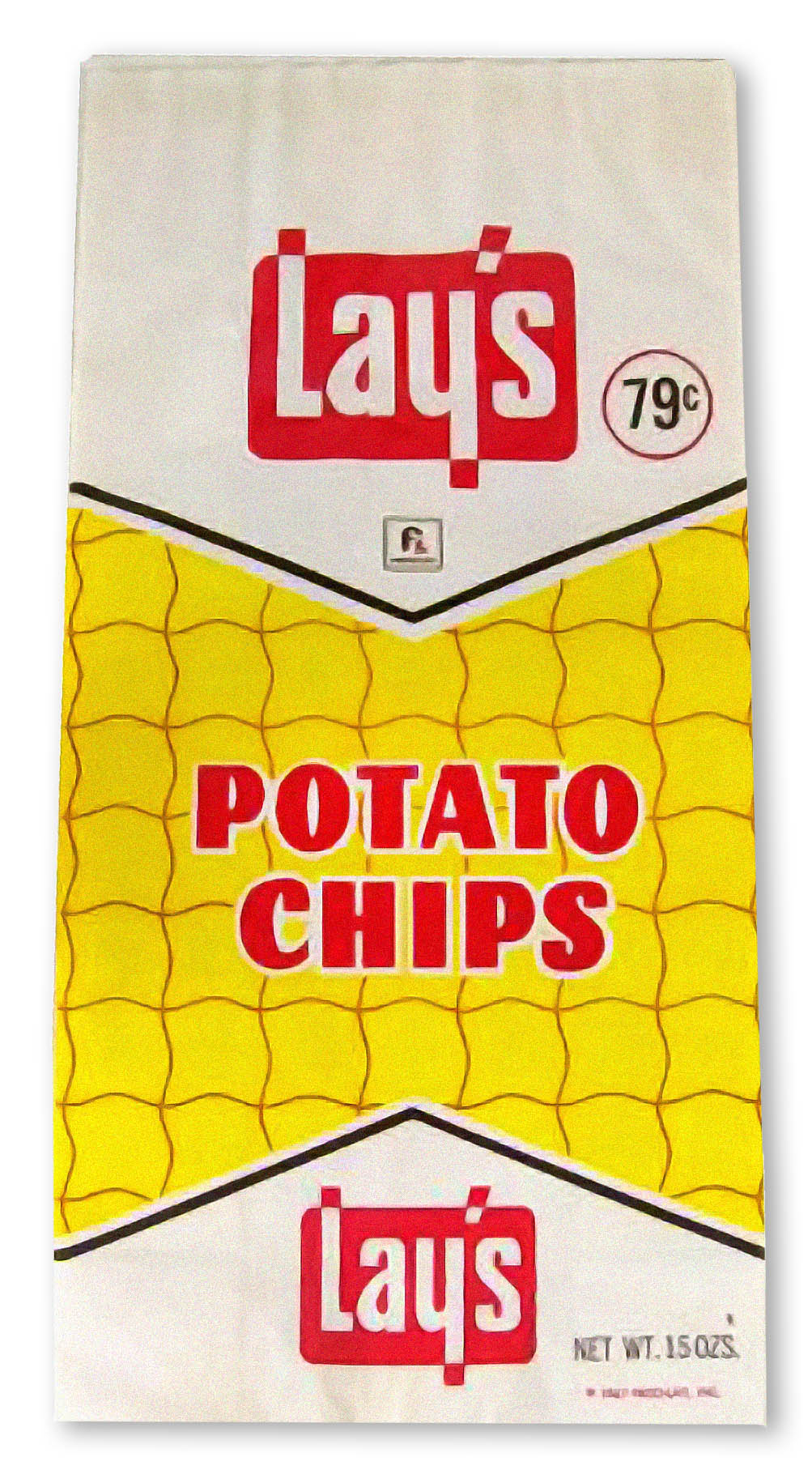
Christian Bale as Ken Miles is in his beat-up woody station wagon driven by his wife Mollie, played by Caitriona Balfe, when he reaches into a grocery bag on the back seat to pluck out a bag of potato chips. But it’s not Back to the Future and the chips are definitely not from the sixties. Look at a real bag of Lay’s from 1967. For one thing, the movie’s chips are in a foil bag, a packaging that wouldn’t arrive until a decade later. And they are wavy potato chips, a style that wouldn’t be sold for another three decades (Ruffles doesn’t count—they have Ridges, not crinkle cuts).
But most of all, the package design was straight out of the twenty-first century! The four-color printing, the hero image of the chips, the faux-distressed typography, and the bright colors are exactly what’s on your local supermarket shelf right now. Maybe the producers didn’t want to bother with a licensing deal, so they just picked up some generic house-brand chips (there is no logotype on the package) but the design still gives it away. I thought I was the only nerd to pick up on it, but a quick check on the Internets revealed others had already caught the goof, although nobody specifically noted the typography.
It reminded me of how little regard production designers have for the impact of graphic arts. Typography, colors, images, and logos immediately conjure a time and place, and when something is off, viewers notice—specifically if moviemakers make the mistake of thinking that information design will never change when they often go to great effort to reimagine everything else.
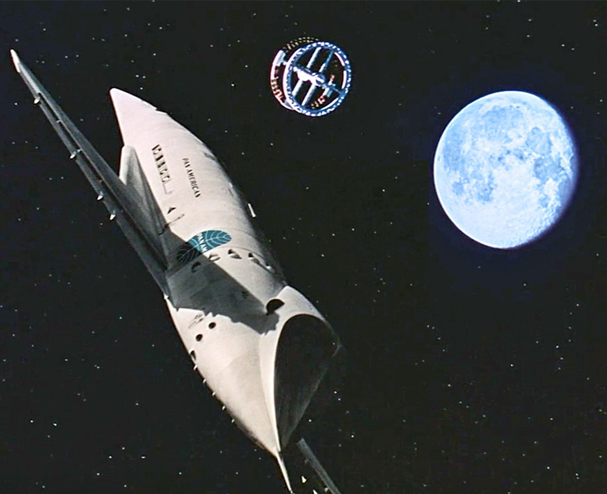
Watching 2001 A Space Odyssey, the imagining of near-future spacecraft, furniture, clothing, and electronics is still impressive. But when Dr. Heywood Floyd arrives on Space Station 5 to the tune of the Blue Danube—on a PanAm shuttle no less (oops)—it is disconcerting to see him walk past a Bell System (oops) “phonebooth” and a Howard Johnson’s (oops) lounge, complete with their contemporaneous ’60s logos.
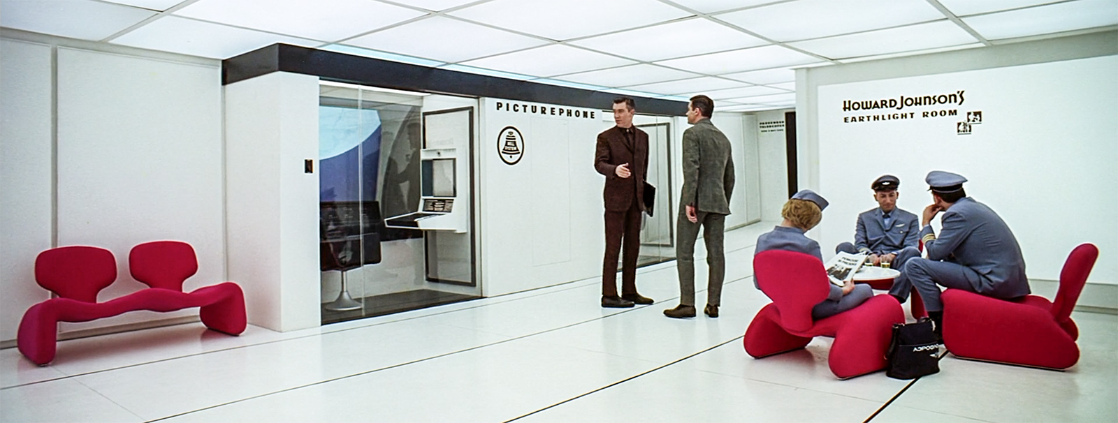
Imagining that corporations would seek to commercialize space was a prescient idea, but it apparently didn’t occur to set designers that after three decades their branding might be updated. And imagining these big companies would be out of business was unthinkable. Of course, when movies and TV shows try to imagine the graphics of the future, or even the past, they often use little imagination to predict how technology and the user interface (as we like to call it now) might evolve. But that is another entry.