TIME Magazine made a big deal out of changing its logo on the November 2nd issue. It actually changed its title—not its logo. The word “VOTE” replaced the usual title to emphasize the importance of voting in this crucial election on November 3rd.
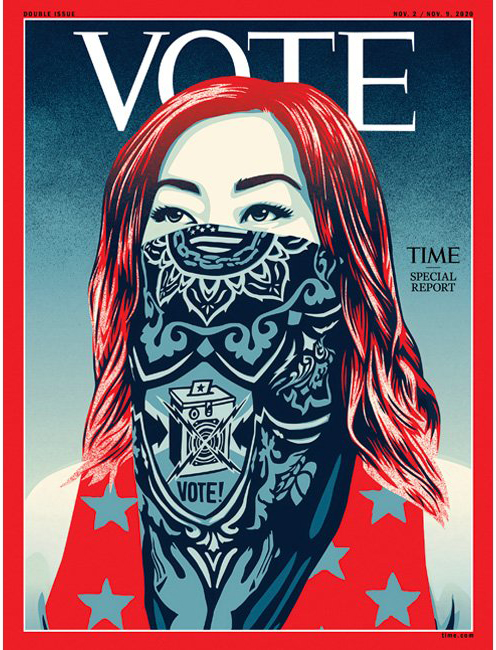
Here’s the cover. They may have changed the word but they didn’t change the typeface or the size and position. The distinctive font with the pointy serifs actually harkens back to a version from the 50s and has been in use for the last twenty years. Most of the history of the magazine had the namplate with widely spaced letters, and the fonts changed slightly with every redesign.
There is a lot more to a cover template than the nameplate, and while that is important it is all of the repeated elements of the cover that makes a long-lasting impression.
While we are at it, there is a lot of misunderstanding about what is called what on magazines. The name of the magazine is the title; the title as positioned on the cover is the nameplate, and if the nameplate has a unique design it can also be called the logo or logotype, (but a nameplate can be a logotype, but a logotype might not be a nameplate.) Many people mistakenly call this the masthead, but that is actually the magazine’s personnel roster and fine print which is usually found in the opening pages or near the TOC.