The best part about creating a magazine for magazine creators is indulging in the granular details of the process. Nerdy-but-necessary topics—typography, digital production, photomanipulation, scheduling and organization, hardware and software for production, and more—often came up in our shop since seven designers and two production people were producing a few hundred pages of editorial a month.
One goal of [FPO] was to apply the ideas we promote when redesigning other publications. The first critical task of publication design is curating content.
A good issue map is like building a house. It’s the blueprint for how readers will enjoy “living” in the magazine, find their favorite places, and become familiar with the different parts of every issue. It’s the organization into specific topics and formats and how they lay out that readers enjoy. Browsing through an issue should be like moving through a floorplan, revealing structure and purpose.
That’s the goal of a good template—creating a fun-to-read magazine that leaves the reader anticipating the next issue.
[FPO] had three mission goals: celebrate publication design and our obsession with magazines; educate readers in the tools, techniques, and history of the many disciplines that should be part of a professional designer’s expertise; and promote creativity and passion in every aspect of the work that we do.
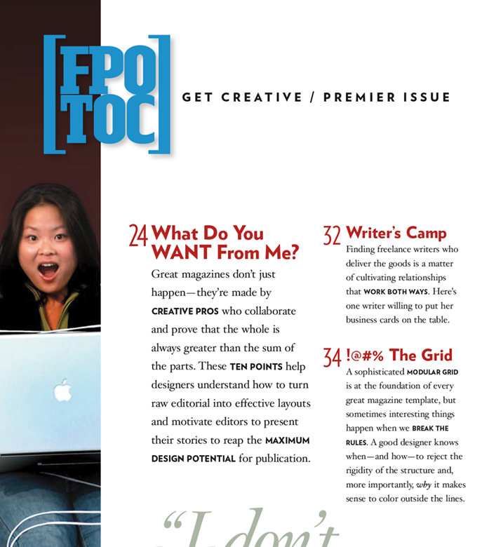
The TOC for the first issue demonstrates how we organized the magazine around the mission, built unique branding for each section, department, and feature, and applied a signature editorial tone to the copy. The book had four distinct sections, [Pasteboard} was a fun grazing section, [Process] about creative design and production, [ToolBox] drilled down to specific lessons for using tools of the trade. The back section was [R&R], a reference section with valuable resources for any magazine.
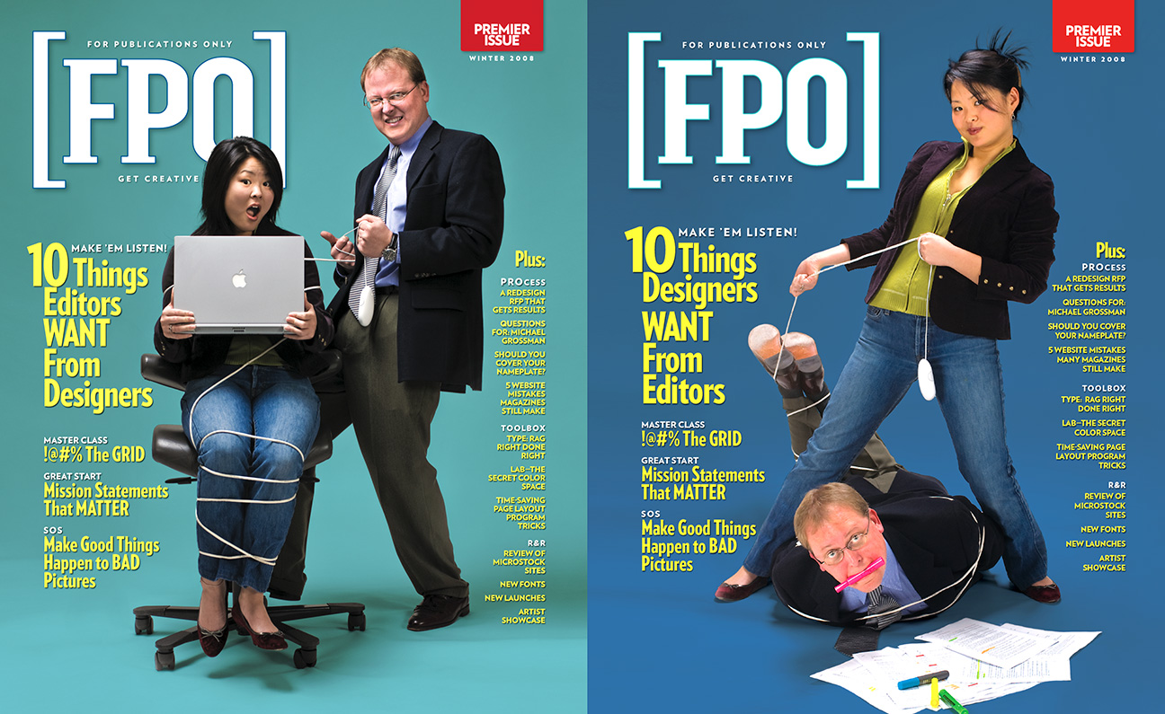
We also used the magazine production to show off some tricks of the trade. The premiere issue had two covers randomly applied to the entire run. Because we printed the cover form two-up, the additional cost was zero.

We mailed 20,000 free issues to subscriber lists from the other design publications. We managed to get about 2000 subscriptions, way better than the 2% return that is the norm for a targeted fishing expedition. The feedback was positive, and I felt we had a product that could grow as we exposed more people to [FPO]. I was confident that my passion project—producing a design magazine that I wanted to read—would pay off.
The creative part of producing [FPO] was tremendous fun. Commissioning writers, illustrators, and interviewing publication designers at the top of the field was rewarding. Tracking subscriptions, sending invoices, pushing for new subscribers, and dealing with customer complaints were not so interesting. Still, we all became aware that the business side was an essential part of building a successful magazine, a thing we hadn’t had to deal with before.
Things might have progressed successfully, but something happened that not only crippled the magazine launch but almost dragged AURAS Design under. It was 2008, and the housing bubble had burst due to the greedy shenanigans of speculative investors. The Great Recession plunged America into two years of unprecedented economic dismay—at least until COVID-19 hit in 2020.
The “run-flat” business plan always assumed that AURAS would continue to bring in a healthy income, allowing the subscriber base to grow, but in the space of six months, we lost half of our magazine clients. And institutional subscriptions of [FPO] that were the backbone of our readers dried up as schools, studios, and corporate marketing departments clamped down on unnecessary spending.
We still forged ahead with two projects reflecting AURAS priorities for good magazine design—a continuing series of articles about redesigning publications and a unique “tentpole” annual issue of alphabetically-arranged ephemera from the current state of publication design. The series of six articles became the book, Six Degrees of Preparation, but the tentpole issue was due for its second annual appearance when we finally had to pull the plug.
The Magazine Design from A-Z issue might be the one that makes me the proudest. Encapsulated in those pages are all our mission goals. After more than a decade, a lot of the content is still relevant—or at least fun to read.
The business plan for [FPO] was ambitious. We wanted to have conferences, an awards program, build online portfolios, partner with prominent vendors like Adobe and Quark, and build a publishing business. None of that ever happened. We were short an issue on the subscription and refunded 1200 people some of their money. We probably didn’t have to, but I felt like we needed to.
[FPO] never went viral. The magazine industry was never the same after the Great Recession. The rise of the Internet and the loss of publications as money-making assets of associations cut deeply into many design businesses, including AURAS. But 2009 was the only year we have ever shown a loss, albeit a pretty big one.
While the run-flat model never admitted defeat was a possibility, the economy’s free-fall created a one-two punch of cutting the growth of [FPO] off at the knees and tearing the heart out of AURAS’ client list.
In the end, there were two positive outcomes to the launch and two-year history of [FPO]. First, the magazine demonstrated what AURAS could do, and it still had value even as an enormous studio promotion. We attracted enough new clients to eventually overcome the depression and recoup a lot of our start-up costs. Second, the whole experience of trying to realize a passion project, despite the cost, was a hell of a lot of fun, and that, as they say, was priceless.
