Graphic design has an intuitive element, a playful, searching, out-of-mind approach. But the way I design is based on starting with that creative mind-stretching and then applying a more rigorous critique to the results.
Design is about solutions, but not just good solutions, elegant solutions. What makes an elegant solution? Four things—simplicity, depth, originality, and inevitability. The first two seem incompatible opposites, as do the last two. But that’s the point. That’s what makes it a puzzle to solve as a designer. That’s what makes it delightful to everyone who “gets” it—hopefully, everybody.
Graphic Design is “simply” the combination of images, words, and ideas to create instantly accessible meaning. Using cultural references while integrating all the elements produces a new “thing” that individual elements can’t wholly convey. This complex interaction makes it easier and faster to comprehend and creates new meaning. Technically, it all happens instantly because it works on the recognition system of the brain, which operates more immediately than higher cognitive functions. It can work in creation as well as comprehension. Sometimes a design can have more meaning than you even meant to include.
The design challenge is creating elements that produce a greater depth of understanding. A successful result usually amounts to the viewers muttering under their breath, “Wow. That’s so neat and so obvious—why didn’t I think of that?”
The Apple logo is a perfect example of combining iconic objects that, when used together, convey the seminal philosophy of the new company.
Here are the components:
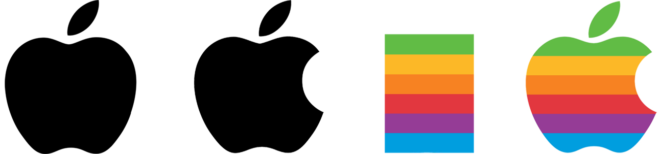
Start with an apple. After all, that’s the name of the company. If you reduce the shape of an apple to its most iconic shape, the core, and flesh, plus a leaf, it’s instantly recognizable with extraneous context. An apple has a variety of cultural contexts: it is a symbol of health (an apple a day…), a part of education (bringing an apple to your teacher), and quintessentially American (apple pie, Johnny Appleseed).
But add a bite taken out of it, and there’s a critical reference added: Maybe it means just that you’ve “used” the Apple by taking a bite. Or—an even more sophisticated reference—the bite Eve took out of the apple that granted humans knowledge, self-consciousness, and moral discernment. The two ideas generate a strong connection, not to the product itself (Like the IBM logo created by the great Paul Rand) but to using those products. Again, this is represented by the most minimal of shapes, a simple negative arc. According to the designer Rob Janoff, the “bite” was just distinguishing the apple from a cherry and a pun on the bite/byte. But there is no doubt that the biblical context—however unintended—was seized upon almost immediately.
The original logo included a brightly colored rainbow. It was, after all, the mid-seventies, and style is a crucial element for creating context. Nothing says “We’re the anti-IBM” than psychedelic rainbow colors. It implies creativity, alternate culture, and unexpected delight.
The first two elements combined create a logo of complex yet immediate recognition. The third element establishes a style that sets a philosophical tone that helps the company stand out from its competition. Nothing is confusing or extraneous about the design.
When Janoff presented his Apple logo to Steve Jobs, he immediately accepted it. Jobs saw it and said, “That’s it.” That’s the effect a great design should have.
Now consider the original Apple Computer Co. logo, which barely lasted a year.
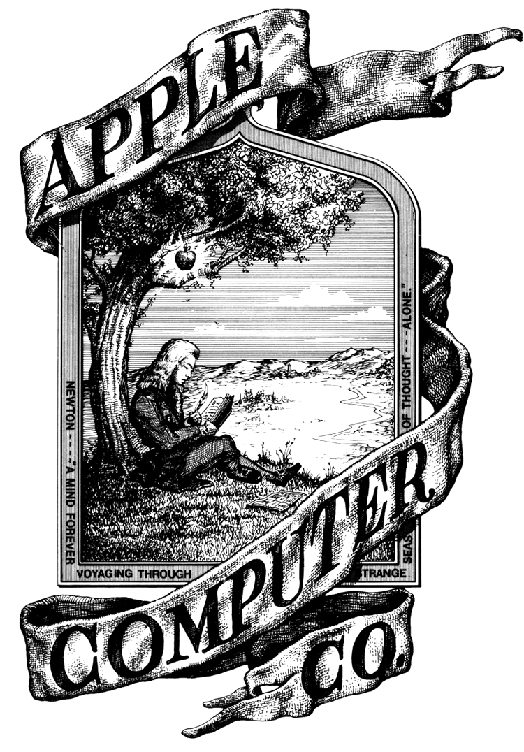
The original idea might have some merit. It’s Isaac Newton just about to be enlightened when the apple falls on his head. But—ignoring that concept—the apple looks like a lightbulb illuminating his book. Even if one figured out that it was supposed to be Newton, the apple is such a tiny component of the image.
Then there is the issue of artistic context and legibility. Some businesses may want to look like their origins are in the 17th Century, but computer sales are not one of them. The Apple logo is sometimes used as small as a quarter-inch high. How would you even use this?
The original logo fails as an elegant solution. It is neither simple, deep, authentic, nor inevitable. Instead, it has too much illustrative distraction, little immediate impact, and no originality whatsoever.
An elegant solution doesn’t hit you like an apple falling on your head. It may come as a burst of inspiration, but the subconscious (at least my subconscious) has been busily juxtaposing all of the elements. It might seem intuitive in the moment, but it’s the result of juggling ideas defined in trying to find the elegant solution.
It’s also critical that design is about tone and structure. The Apple logo lost its rainbow in 1998 when Jobs came back to head the company. There was no need for a Peter Max-inspired idea whose time had come and gone. Besides, by the turn of the century, Apple didn’t need to compete against IBM—it was IBM—and it hadn’t even released the iPhone.
Tone and structure are intimate components of design. When the tone is wrong, it creates cognitive dissonance. When structure is wrong, it hampers comprehension. Anything that gets in the way of “getting it” is a distraction. When designing a magazine, the tone and structure have to align with the mission and content, or the magazine risks focus, and subscribers notice.
The most uncomplicated editorial design is the pun. A pun in a headline adds two meanings to one idea, and the playful (or sarcastic, rueful, horrific, naughty) tone adds meaning.
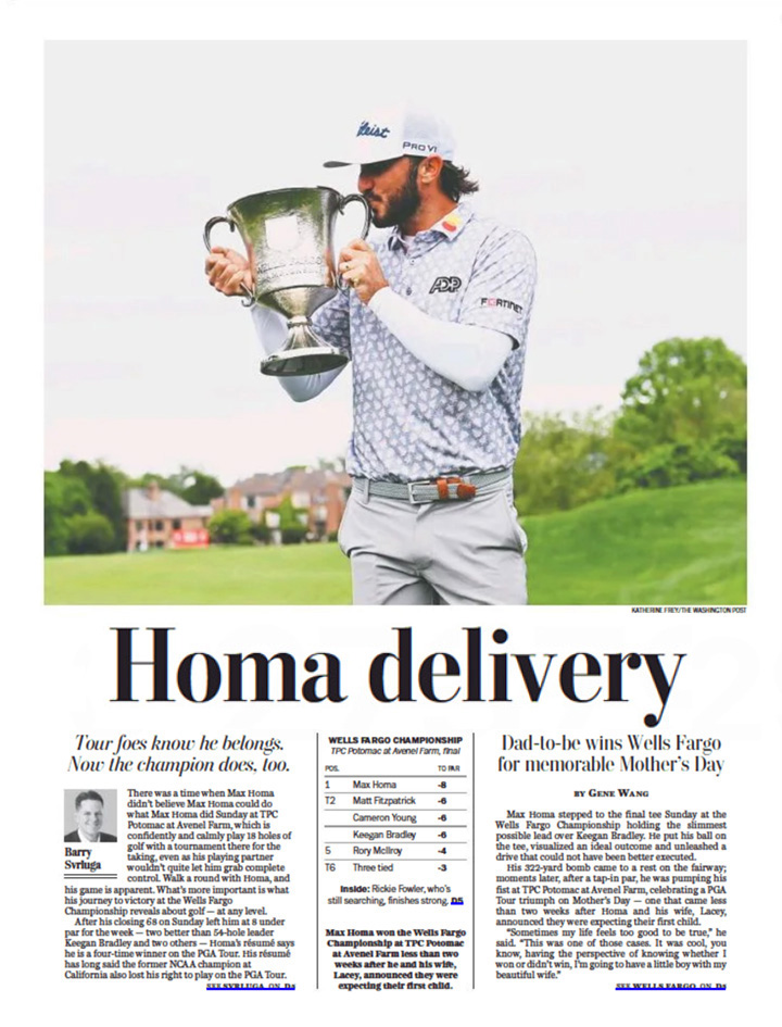
I have always thought that instead of running a design studio, my real job in life should be writing headlines for the Washington Post. Every day there’s a headline or two with a punny bent. Sometimes profound, sometimes stupid, they are meant to attract readers. They are seldom seen in the “A” section, where levity could be confused with insincerity. But in other parts of the paper where having fun is permitted, whoever writes the headlines can indulge. The example here is from the Post Sports section on the day I wrote this.
Design is a series of choices. What to leave out is as important as what to include. The struggle between simplicity and depth is a battle for clarity. Inevitably, something needs to give. That’s what the designer balances through experimentation. Using an apple to represent a company called Apple is just a matter of picking the low-hanging fruit. Making it mean so much more requires a lot more thought—and a little inspiration.