AURAS has generated about a half-million pages of content in the last 40 years. That accounts for about 5,000 issues of magazines and about 6,000 other projects, from business identities, marketing materials, and editorial assignments from government reports to books. With all that content moving through the studio, it should be no surprise that disasters occasionally strike when you least expect them. I guess that’s why they’re called disasters. Some are caused by the relentless deadlines that are part of the business; some are a perfect storm of stupidity and inattention. And some are so ridiculous that the only logical response is to assume the fetal position and squeeze your eyes shut. Like these.
Don’t You Know What the Hell “Hot Type” Is?
My earliest graphics job was working as a production artist at Colortone Press, a small printer and publisher tucked into an alley in Adams Morgan. The head of production, Bill Meadows, warned me that my job would mostly consist of the drudgery of replacing the prices on old boards of the catalogs Colortone used to sell its books. Typesetting being expensive and priced by the word, they would only set the price itself; each sheet of type had dozens of tiny prices that all had to be “cut-in” to the art. The repro was affixed by waxing the back of the sheet with a roller waxer. On my first day of work, I accidentally fed the repro upside down, coating the type with a thin layer of wax. Having some experience with paste-up, I thought I could use solvent to remove the wax. But when I did, all of the type was smeared into a blotchy mess.
I had never seen repro made using a linotype machine that cast metal slugs to be typeset, which was then inked onto repro paper. I had to confess my error to the production manager, who sternly asked, “Don’t you know what the hell ‘hot type’ is? Do you know what this will cost to re-do?” I thought I was fired after one day at work until he burst into a big grin and said that smudging happened all the time, and “that’s why they give us three copies.” I learned a lot from Bill Meadows.
Are My Eyes Going Bad?
When I was in college, I started designing Biblical Archeology Review. I knew the editor, and publisher Hershel Shanks was a cheap son-of-a-bitch. After all, I was only making ten dollars a page. He hired a small start-up type vendor for a few issues. The “shop” consisted of one man in his grade with an old photo-typesetter and processor. His galleys always stank of fixer. After a few issues of poor proofing and late delivery, I told Hershel that I’d quit if the guy didn’t deliver on time. This time, the type arrived with barely enough time for paste-up.
But as I worked late through the night to make the printer’s deadline, I noticed, horrified, that the type I had pasted down was beginning to fade. Irregular swaths of the type were turning light brown. Whether it was overworked fix in the processor or incorrect solution strength, the phototype rolls hadn’t been “fixed,” and exposure to light was making the text fade. The typesetter couldn’t re-output the type because he had destroyed the original typing. There was only one solution. I finished the paste-up in low light and took the boards to be shot on a stat camera, creating a fixed page. The resulting columns of text varied in weight and softness but were at least legible. And I finally hooked BAR up with a legitimate typesetter.
Where the Hell is the Type?
We went through three imagesetters before digital technology sent them to the same junkheap as PDAs, Laserdiscs and bipartisan politics. But while we had them, they produced hundreds of thousands of dollars in revenue with very little maintenance. Unlike a service bureau or a printer, our files always originated in-house, so we never had the kind of mistakes that came from missing fonts, low-resolution images, wrong color spaces, or accidental layout glitches when outputting work from dozens of studios. That doesn’t mean that errors didn’t occur or went unnoticed when we sent our packet of hundreds of pages of film off to a printer.
The worst mistake occurred because of an upgrade to QuarkXPress. It was supposed to be a minor bug-fixing update, but it introduced a glitch when outputting film. We sent an entire issue of film to the printer of Destinations magazine, and after they stripped it up to make proofs, they called and said that there was no way they could print the magazine. Their problem didn’t make sense. They said, “There’s no black type.” Except there was lots of it—most of the type was black. We output a test page, and sure enough, on the black plate there was no type. Instead, it was on all the other plates. To print type “black” required exactly registering the cyan, magenta, and yellow plates well beyond the capability of any printing press.
Quark’s update changed the prepress description of “black” from “100% black ink” to “100% cyan, 100% magenta, and 100% yellow inks. Luckily, we caught it before anything was printed, although we had to output an entirely new set of films, pay for the scrapped stripping work, and eat overtime to keep the delivery schedule. But we did.
It was only later, when we looked at another job that we realized we’d generated a whole set of negatives with the three-color black, and the printer—probably not wanting to make a fuss—had printed it without raising the alarm. The job was sheetfed, so it didn’t look too bad, but a close examination with a loupe revealed the halos of the primary colors. The client never complained, and we never said a word.
Check, Mate
There are mistakes you don’t catch, and they aren’t the kind you can blame on some software or production glitches—just plain old inattention to details. Naturally, they happen where it’s least noticed and cause the most trouble.
There are two issues of Biblical Archaeology Review that have the same month, issue and volume on the covers, and the same month on the running feet throughout the issue. It happened decades ago before digital anything, but it was a real lesson not to use the same boards to paste up the next issue. Now, there’s always an asterisk in the indexes and online search for the two-issue/same-date mistake to remind us of our sin.
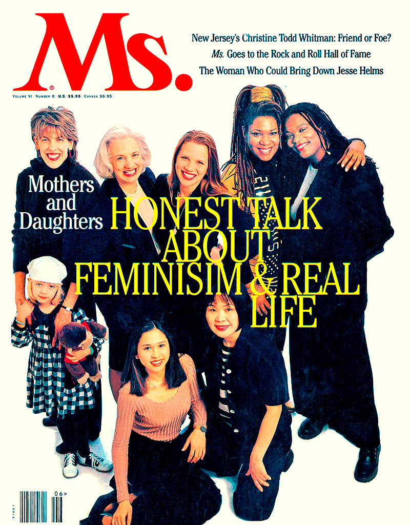
Beware the headline typo! A famous cover of an early Ms. Magazine has a typo right in the giant headline. Somehow through multiple proofing steps, they had missed the most obvious mistake. We laughed at that until we made the same mistake in one of our magazines. It’s a cover subhead, so who bothered to check it? Obviously, someone should have, and from that point on, we did.
There was nothing to be done about the missing running heads in a publication for The American Chemical Society. They appeared in every proof we made, and even in the proofs from the printer—bold white running decks knocking out of colored bars on every spread. But when printed, they weren’t there. The ultimate answer to the mysterious disappearing rubrics—they were all set to “overprint” but showed up fine in digital proofs. But not when separated into printing plates—white overprinting anything is just nothing. How that happened and why the mistake wasn’t caught at the press proof is another story, but one that we weren’t privy to.
The miracle is that there weren’t more.