One of my favorite magazines has been Saveur, a quirky magazine spanning two niches—cooking and travel. The publication was co-founded in 1994 by Dorothy Kalins, Michael Grossman, Christopher Hirsheimer, and Colman Andrews. A fortuitous collaboration of people with talents and backgrounds, their unique vision of melding two popular enthusiast magazine genres—food and travel—was a new idea. And it was pretty unusual one of the founding partners to be a designer. Grossman’s original design—with a bit of tweaking—has mostly survived for 26 years, which is quite a feat for a publication designer.

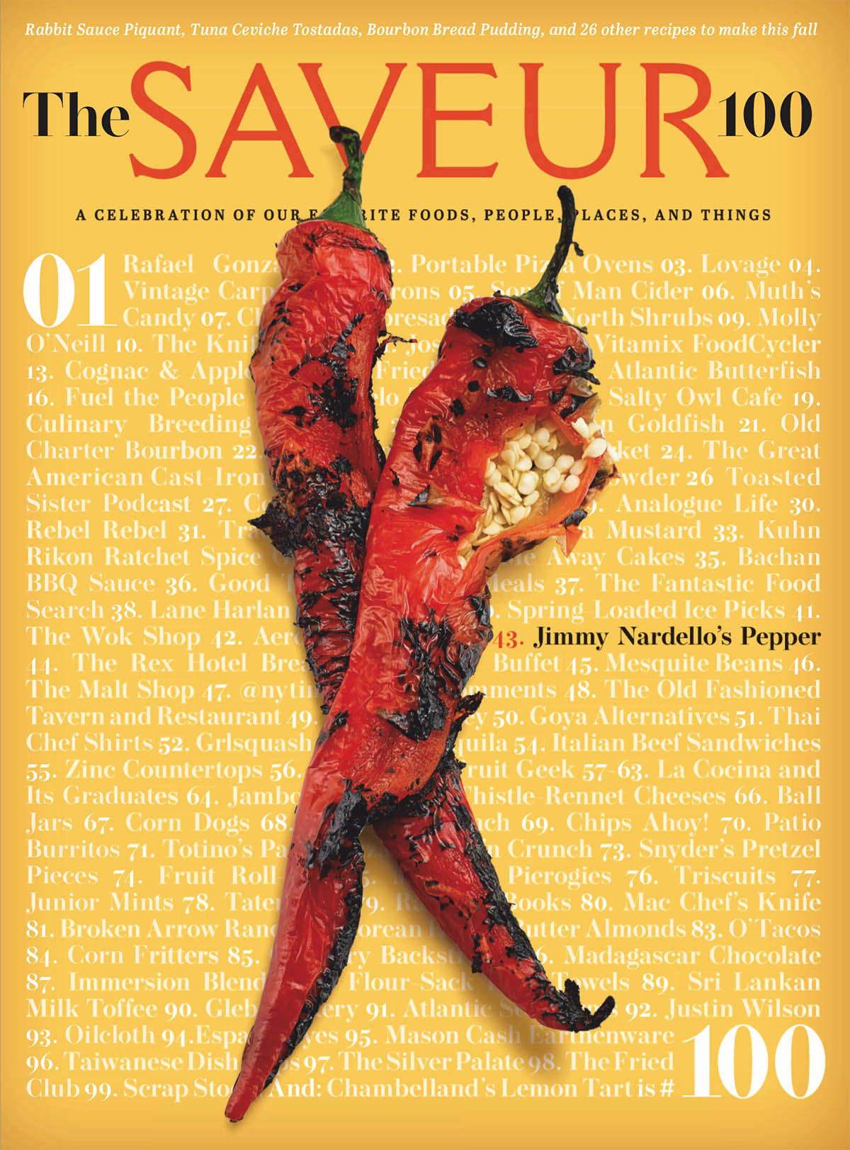
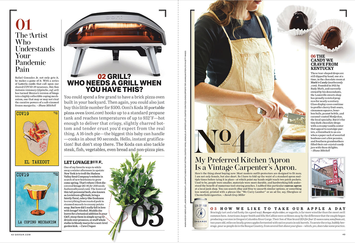
I always looked forward to an annual special issue—The Saveur 100, an issue almost entirely devoted to a list of “favorite restaurants, food, drink, people, places and things.” Presented as an issue-long listicle, the eclectic hodgepodge of short articles held together by the list theme broke the format of the magazine and always presented interesting content in a freeform design. It always yielded surprising tidbits of knowledge, tools, techniques, and products, many of which could be ordered for delivery, even in the pre-internet, pre-Amazon days of the Nineties.
Today, after a few rocky years, it exists as a quarterly but still holds true to its DNA of combining a world of cuisines and the places and people they come from. But four issues a year has not left room for an entire issue dedicated to The Saveur 100—until this year. After a five-year hiatus the current issue has resurrected its signature feature in fine style.

I have always been inspired by this issue as a perfect example of a great collaboration of design and editorial, and the way publications can create branding through the curation of content. Like the Fortune 500, the Sports Illustrated Swimsuit Issue or TIME’s Person of the Year, special-event issues can almost transcend the magazine itself. In fact, in spite of the fact that U.S. News and World Report hasn’t existed in print for a decade, it still makes news every year publishing its list of Best Colleges on its website. Special issues can become tentpoles to build an entire volume around, enhance readership and advertising, and project interest in the magazine beyond its niche.
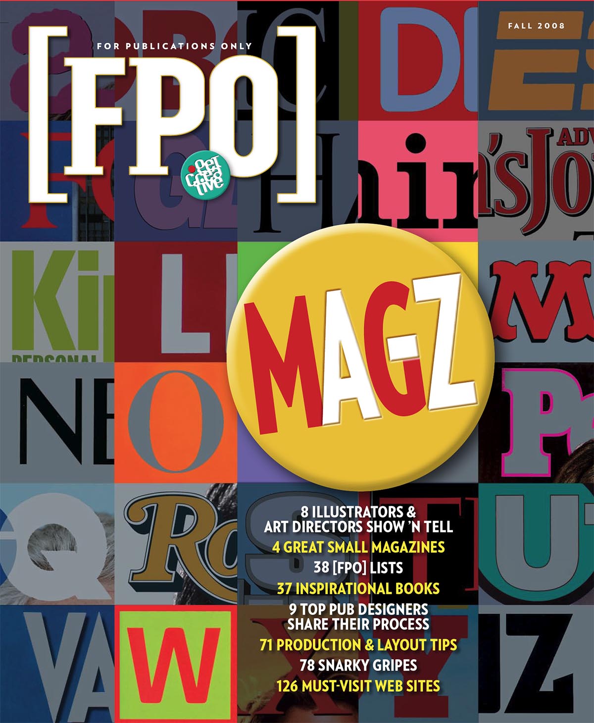
That was why when we created [FPO] magazine, I really wanted to create something similarly ambitious. The result was “Magazine Design from A to Z” an issue dedicated to all things publication design-oriented featuring work from and by a host of writers, illustrators, and designers plus a look at design through the prism of popular culture. Reviewing the issue a decade later, it is still a ton of fun to read. That’s why we are posting the original issue for your enjoyment. Yeah, a lot has changed, (Snow Leopard, anyone?) but it still ranks as one of the best things AURAS has ever produced.
