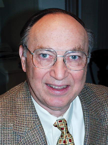
Hershel Shanks 1930-2021
AURAS has had clients that have relied on us for years, but none of them compares to The Biblical Archeology Society which was one of my first 43 years ago—even before there was an AURAS Design—and still is today. The reason for this longevity is because of one person: the founder of the Society, Hershel Shanks.

Last month, Hershel died of COVID-19 at the age of 90. He had retired from editing the Society’s magazine, the Biblical Archaeology Review only a few years earlier. He is probably more responsible for my business philosophy than anyone else, but often in the way that the grit is what makes the pearl.
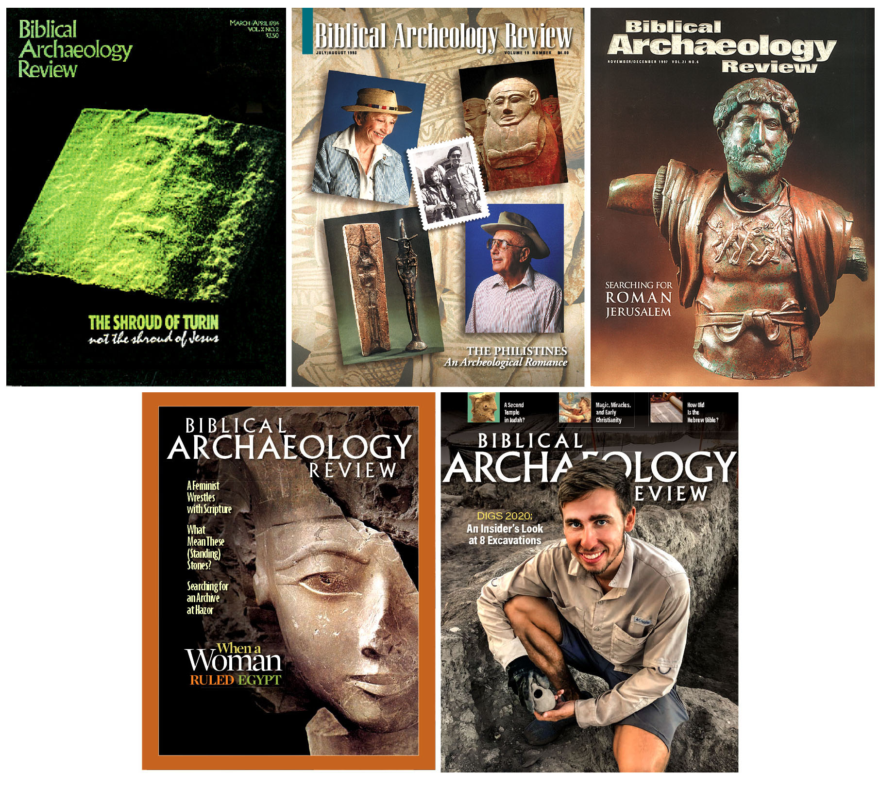
Over four decades we worked together to grow his little magazine idea into a big business. We redesigned BAR five times, created three other publications for him, and produced almost every issue of every magazine he has ever published—more than 600 of them, or about 40,000 pages of editorial.
If I were to write a book about our relationship it might be called, “Everything I Know About Running a Design Studio I Learned from Fighting with Hershel Shanks.”
It began because Hershel didn’t really know what he was doing—and he was cheap. He created the Biblical Archeology Review almost on a whim. After family trips to Israel where he explored the remnants of the ancient City of David, his interest in biblical archaeology began to overtake his successful career as a lawyer.
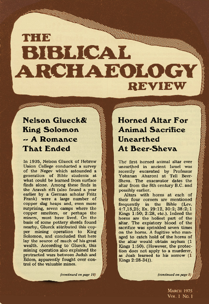
Without any academic credentials in the field or experience publishing a magazine, in late 1975 he bought two ads for a charter subscription to the Biblical Archeology Review, one in the New York Review of Books and one in the Jerusalem Post. He got back 75 orders. By the spring of 1976, he had 4,000 subscribers. To produce the first issue, he enlisted help from a designer-neighbor named Judy Mays.
After the first three issues, Hershel was outraged when Judy requested an increase in her page rate from $5 to $7.50. I was helping her paste-up some of her projects, so to get out of the job she suggested to him that I take over. She warned me that Hershel could be “difficult.”
I was working freelance at The American Chemical Society doing production work for their many publications, and while I learned a lot there, my expertise was only slightly more advanced than Hershel’s (although I would never have admitted it).

But I did convince him to let me redo the magazine after proving that an 8½x11 magazine would cost nearly the same as the 7×10 issues he was printing and would be more competitive with “real” magazines. It was the first magazine I ever designed.
The result was something that looked much more like a consumer periodical with a color cover and real departments and features. I was pretty proud of it, but Hershel really didn’t understand about magazines having a template. He insisted on moving the nameplate around the cover and changing its size as needed and making the body type change size and lead to fit the space—even then I knew those were bad ideas.
He also insisted we fill every square inch of the page with copy, and margins and white space were a waste of paper. It took a while for him to realize that consistency was part of a magazine design and that open space was just as important for readability as text.
We always met at his house for production meetings, even long after he bought a building to house the Society, because he liked the “start-up” vibe of sitting around his living room. Often the meetings would end up in arguments about small design details or overwrought discussions about titles for features that, both of us being stubborn, usually revolved around the two of us going at it while the other participants watched.
Once, a new advertising manager sat in on one of these meetings. Afterward, back at the office, he asked BAR publisher Sue Laden, “Is Hershel going to fire Rob?” To which she replied, “Oh no! They bicker like father and son all the time!”
Well, sometimes it felt like that. I knew that he would never fire me. For one thing, I never was actually employed by BAR—we always negotiated a contract. As AURAS grew, he worried that BAR was becoming too small a part of the studio’s accounts, but despite our sometimes-tumultuous relationship, he knew I would never “fire” him either.
In my defense, it could be exasperating. At one meeting Hershel complained about the way a couple of letters were kerned in a headline and, in spite of my measured explanation about letterspacing and fitting headlines for “balanced negative space,” he made the proclamation that henceforth, no letter should ever touch another—that was his way of definitively putting the issue to rest.
After a lot of eye-rolling, I finally decided the best solution was to show him what it would look like to follow his rules. I sent him a few headlines that used the most egregious combination of letters that produced heads full of gaps and odd spaces. After that, he never said another word. Hershel would never admit when he was wrong, but he would acquiesce to better ideas when he saw them.
I learned something valuable in those meetings. Even though I was “just” the designer, I got used to having a voice as part of the editorial team. It seemed only natural to make suggestions about the structure of the stories, their titles, and even the addition of more copy that could help flesh out the content.
Not many of our clients worked that way. Designers design, editors write.
Our most successful collaborations over the years have been with clients whose trust we’ve earned by demonstrating that our editorial contributions make their publications better—and their jobs easier. Plus, it is just more fun that way.
That is another quality that Hershel exuded: how much fun he had with the process of producing each issue and how much pride reviewing the printed product. If working together can’t be enjoyable, even a bit tumultuous, where’s the fun in that?

Over the years our relationship changed. Other designers at AURAS designed and produced his magazines. I was just the referee who worked to resolve intractable issues of design vs. editorial and worked on other design projects like books, catalogs, and redesigns of the magazines.
Hershel never became a “magazine guy.” He didn’t care about reader trends or issue structure or creating interactive content—he just loved the features and how they could incite controversy among the academics who looked down their noses at him or “scoops” to thrill his readers.
When he demanded changes that seemed capricious or too difficult to pull off, I always told our designers two things: you are always designing for an audience of one, and no design is successful unless you find a solution that satisfies Hershel—and yourself. After all, they’re his magazines.
The last time I spoke to Hershel was at a holiday party a few years after he stepped down, just before the coronavirus shut things like that down. I had just redesigned BAR for the fifth time—the first without him as editor. With 40 years of experience designing magazines, I thought that he would be proud that I had built a great editorial template with classic BAR features but also exciting new curated editorial packages for short stories, news items, and revolving content. Hershel looked at me conspiratorially and said, “I see you’ve finally got your way with the magazine.”
One Response
Rob- What a great and touching tribute to your working friendship with Mr Shanks. I remember him fondly, especially when he drove me to the metro one evening as was raining and you and he had been debating some layout issue(!) and the day went later than usual. I also still have many good memories at Auras working on BAR, back when the studio was in an apartment building near the National Zoo. RIP Hershel.