No one remembers the page layout wars, and no one cares. It’s like fussing over Betamax and VHS. First there was Aldus PageMaker. There were only 30 typefaces. You started with a blank page and the ability to type directly or import text from a program like Xywrite. You could even add, resize and crop scanned images. How you positioned them was a matter of how patient and sharp-eyed you were, but it was all done manually.
PageMaker 3.0 had progressed enough to become an intriguing toy for creating comps and tiny projects but, even with an expanding choice of fonts, it was hardly a design and production tool. Then, along came version 4.0, which introduced two new features—type style sheets and page templates. That may sound geeky, but if you knew what most designers didn’t know about graphic production, it was apparent you could create complex typeset documents without manually typing or formatting a single line of text or sending the manuscript out to a typesetter. The implications were potentially transformative, changing desktop publishing from a novelty design tool into a production powerhouse.
Almost immediately, I had a chance to test it out. A client, the National Association of Social Workers, had delivered their annual meeting program on a disk. Typically, I would have printed out a manuscript page and marked it up with specs for the typesetter. Instead, I created a three-column template and named and built type-styling for each unique element: headline, title, presenter, description, time, and room. I just had to add the style names to the initial word processing file—Pagemaker would do all the formatting.
I imported that large file into a single blank page. I patiently waited about five minutes, but nothing happened.
I just figured it was too much to hope for, but I left the file open. I went out to lunch but couldn’t sit still, wondering what had happened back at the studio. Excusing myself, I rushed back, ran upstairs where our lone computer workstation resided and turned on the monitor expecting to see the same blank page and blinking cursor.
Instead, there were 150 pages of entirely formatted, three-columns-per-page text, including running feet and folios. I was absolutely beside myself. It is embarrassing to admit, but I recall that moment with nearly the same ecstasy as the birth of my daughter. Because I knew it was the end of sending out for type—and the huge fees that went to the vendor could now be ours.
When we designed the meeting program the previous year, I paid Harwood Type $16,000 for typesetting and billed NASW $18,000. But this time, I charged the client $12,000 and paid a service bureau $400 to output 160 pages of camera-ready repro. NASW thought they got a deal—they did save 30% over the previous bill—and I bought a second workstation.
Most designers had no technical background and didn’t know their world was about to change. Still, because I knew both typesetting and printer prepress, I knew I could replace an outside typesetter with work of the same or better quality. If I had my own imagesetter, I wouldn’t even have to send the PageMaker file to be output.
And, because I had worked at a printer, I realized right away that Aldus’s other program, FreeHand, was actually a sophisticated prepress tool that could output complex CMYK film negatives at a fraction of the cost of building the same pages on a stripping table.
And, because I had learned how to make color separations, I understood that Photoshop was a ridiculously powerful tool for color-correcting, manipulating, and outputting color images—may be more valuable than the state-of-the-art million-dollar Scitex Scanner Workstations.
Anyone without these backgrounds would never realize how significant these fledgling programs would be for a design studio, replacing expensive vendors who set type, made color separations from transparencies, and built complex pages from our primitive multi-layered artboards. Because people don’t know what they don’t know, they don’t see what they were missing.
Adobe bought PageMaker in 1995 and replaced it in 1999 with their own page layout program, InDesign. But, by waiting to replace the established PageMaker in favor of their new program, they unwittingly allowed another upstart program, QuarkXPress, to dominate the growing desktop publishing industry. Quark got the upper hand in the page layout wars by being more aggressive in promoting their program to printers, adding features that designers needed if they were going to send their documents to a real commercial printer.
Quark had figured out that both publishers and printers would benefit by creating a production workflow that enabled printers to output press-ready film without the need for camera work or complex stripping. Because Adobe only thought of the program as a front-end whose output would be to a laser printer, Adobe was slow to understand that PageMaker could be a serious tool for creating professional documents that commercial printers could use. So Adobe didn’t realize how the close relationship between publishers and their printers mattered. But they figured it out.
Quark began to lose ground to Adobe’s InDesign. Some of it was probably hubris—Quark foolishly thought they could never be dethroned as the only publication production tool whose files printers demanded. They didn’t update or add new features that designers wanted. Mostly, they didn’t know what they didn’t know about how designers hated sending native files to printers. But Adobe had the answer—the PDF file format. They made sure that printers could see the advantage too. That’s what doomed Quark.
InDesign introduced many other features that designers clamored for, like soft drop shadows, transparency for items, turning type into outlines. Still, the most crucial feature of InDesign—one they didn’t even know they needed—was embedding the creation of PDF files in the program. Instead of burning images, fonts, and layout files to discs, they could easily send the self-contained compact files to printers using this newfangled thing called the” Internet.” (This may sound trivial today, but back then, it was a big deal.) After Adobe fully integrated InDesign with Acrobat, Photoshop, and Illustrator, Quark’s user base fell off a cliff. Twenty-five years ago, nearly 90% of all publishers used their program. Today it is less than five percent.
AURAS switched all the magazines we produced to InDesign in 2005—way later than I would have preferred—because our designers were so comfortable using Quark that it was like pulling teeth to make them change, and we output our film in-house. They had no idea what they didn’t know about InDesign. But it wasn’t too many weeks before everyone said, “Why didn’t we do this years ago?”
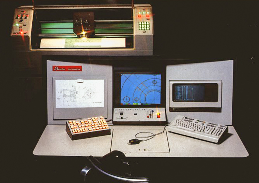
I knew what a PDF workflow would mean for the printing industry. We had added image-processing equipment in 1990 and by 1998 were on our third and most potent imagesetter. Most printers had bought their own imagesetters and output film just like we did, so they were happy to use ours. With an in-line processor and auto-cutter, it spat out CMYK film sets with little intervention. An average magazine consisted of 250 sheets of film. At $15 per page, less than the printer charged for the same thing, we averaged about $3,700 an issue. And in 2000, we produced 120 issues from 17 different magazines. Watching our Accuset 2400 drop film sheets into the output bin was like watching money being printed.
In 2001 something began to change. Printers began to request PDF files. The introduction of the digital platesetter, which could scan a press plate directly from a PDF file, eliminated the need for film—and the artisans who had been producing it for a century. Even in an industry slow to change, the economic advantage of the new machines was so compelling that the transition was almost immediate. In 2000 we output 30,000 sheets of film, and by 2003 we output 3,000 sheets.
The days of printing money were over.
Adobe won the page layout war—at least until someone makes a more compelling program. AURAS hasn’t delivered a magazine template in QuarkXPress for more than thirteen years. The client who contracted that design recently called on us to redesign their publication again. They still closely followed the original template from 2009, and even more surprising, they were still producing it in Quark. This time they wanted the files delivered in InDesign.
While the features in Quark haven’t changed much in a decade, InDesign has steadily added new features. Our new design template takes advantage of many features that Quark never offered. It took just three weeks for their production designer to love InDesign, but when she started using the new design, she called us daily because she couldn’t figure out how we built the template, and we had to explain what we had done:
“This paragraph style uses a nested character style.”
“We have a GREP built-in for that.”
“Use the ‘No Break’ command instead of soft returns.”
“We are using split and spanned columns.”
“We’ve made an object style for that box.”
“Instead of making separate background and text boxes, use box insets to make a single element.”
If those comments don’t ring a bell, they should. After all, it’s not what you don’t know—it’s what you don’t know you don’t know.