The first magazine I ever designed was The Biblical Archeology Review. In 1979 I convinced the publisher of the fledgling publication that he was wasting money when he printed his small 7×10-inch magazine. He could have a “real” 8½ x 11 magazine with a color cover For almost no additional money.. He liked that idea, especially the “almost no additional money” part.
The next few redesign jobs involved cosmetic makeovers of publications that we already were producing—redesigning meant changing the look of the cover, choosing the fonts and altering the layout grid, and maybe rearranging the order of the content. But I began to think that magazine design had to be more than ornamentation. There was a reason that people subscribed to magazines, and the visual design was only a part.
I loved magazines because they were informative and entertaining and because they were an ongoing part of my life. When a new issue came, I had favorite departments, story themes, and contributors, and I looked forward to seeing them month after month. The structure and content were critical parts of the magazine design, and a publication “design” was more than just a nameplate and fonts.
It was hard to articulate those ideas as a teachable concept. As I created sessions to teach at Folio:Show and other venues, I wanted to present a “unified theory” of magazine design. It wasn’t just ornamentation and clever art. Successful magazine design was the total effect of defining the scope of editorial content, presenting that content in unique formats and packages, and building each issue with a consistent structure that used editorial tone, art, and typography to create a distinctive personality.
Magazines are friends that you invite into your home once a month to enjoy their company, and like good friends, you want them to be engaging, familiar and encouraging you to ask them over again next month.
Every magazine that I loved had these qualities. They had specific content that I would turn to before anything else, whether it was the “Miscellany” department in LIFE, “Milestones” in TIME, the “MAD Fold-in,” and even “Hidden Pictures” in Highlights magazine.
Front-of-the-book curated sections were sometimes more interesting than the feature stories. “Man at His Best” has been running in Esquire for decades, while the “Start” section at the front of WIRED and the “Must List” in Entertainment Weekly are both unique editorial parts that define their publications.
Special “tentpole” issues, part of a publication’s annual editorial calendar, significantly increase the brand awareness of the title. Almost everyone wants to know who TIME’s Man of the Year or People’s Sexiest Man Alive is or what Food&Wine’s Best Restaurants in America are. The Sports Illustrated Swimsuit Edition sells five times its average weekly circulation. Vanity Fair’s Hollywood issues, featuring multiple pull-out covers of screen stars, have been its biggest issue every year.
The ideas became more applicable the more we used them for redesigns. These six steps involved:
- Understanding the mission of the magazine, identifying how a title fits in with its genre and its competitors;
- Defining your magazine archetype in comparison to its competition;
- Building editorial and design branding to make the magazine unique;
- Focusing the scope of content into specific concepts and content areas;
- Creating an issue map that organizes editorial into distinctive sections; and
- Fine-tuning the magazine to improve the impact on the readership using a critique we called C/P/R—how well do you engage your specific COMMUNITY, try to simplify and focus your PRODUCT so your readers know what your magazine is all about, and build editorial that is so useful and exclusive your magazine becomes a go-to REFERENCE.
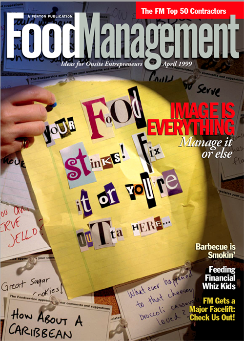
The first magazine we applied this approach to was Food Management, a B2B for institutional dining. We suggested changing the order of the departments, their titles and formats to form two sections called “Front of the House” and “Back of the House.” The former dealt with management and the latter with specifics in the kitchen. The features were between these sections and had more elaborate art and typography. The result was a better branded, more obviously useful publication. The redesigned editorial structure succeeded in many ways. It was easier to produce, more flexible, better understood by readers and advertisers, and more recognizable against the competing publications. They tweaked the design over the years but maintained the issue map until the publisher abandoned the print magazine thirty years later.
Download the précis for Food Management and then download the first issue that we designed in April of 1999. It is still fun to read. Looking at that issue you can see the principles in action:
The book has a clear structure that is easily demonstrated in the Table of Contents.
Each department or column has a distinctive concept and presentation and is branded so readers understand the content is unique to the publication.
Features are themed based on specific mission objectives of the publication, and some of the features are designed to be annual events.
A variety of entry points into the magazine allow readers to “graze,” starting with quicker reads in a curated section, or a specific department that a reader enjoys, or a meaty feature.
A consistent editorial tone and visual style to add a distinctive personality to the title, presented in headlines, sidebars and art throughout the issue.
Most importantly, the magazine has to be enjoyable and valuable. It might be too simple to say, but reading the magazine should be fun. Fun for the intended esoteric audience the magazine is intended for, but also for anyone picking up an issue casually and wondering if there is anything of interest inside.
Every subscriber is compelled by the desire to glean information to improve their operations and performance, but they are also general interset readers too. At AURAS we believe that a successful magazine, no matter how technical or arcane, should have content that any reader would find interesting.
We branded it Six Degrees of Preparation and promoted it whenever we marketed our design skills. After that, our redesign projects increased. We developed tools to help publication staff use the approach and become familiar with the ideas.
The best product was a self-guided evaluation of their current publication and how to apply the principles to improve their content. The 10 Step Do-It-Yourself Critique is a day-long staff exercise for applying Six Degrees ideas. Many of our redesigns begin by conducting the critique with the client to help grasp what they want to change. It remains a potent tool for increasing staff inclusiveness and focusing attention on needed changes publication wants to redesign—or even tweak the current product.
After solidifying the process, we applied it to more than 75 redesigns. This is how we developed the entire editorial map, branding, and calendar for our [FPO] magazine, which is still fun to read. A confirmation that our approach works is that most of our redesigns are used for about a decade. We did several publication redesigns over fifteen years ago that are still active. And, when a magazine does want a redesign, they often return to AURAS. There are a dozen clients whose titles we have re-redesigned. We are working on two of them right now.
These ideas and products remain valuable tools even when applied to websites, apps, corporate branding, and of course, magazines. Download the Six Degrees of Preparation book and the Ten Steps workbook and see if they can’t help your publication.